Fuller & Platt
Brand Identity
Identity system for an avant-garde landscape architecture firm focused creating a renewal in green, urban spaces with organic and mechanical inspired forms.
Brand Introduction
Fuller & Platt is a landscape architecture firm that prides itself on its small, but diverse portfolio of works. The company is transitioning from not only serving international clients, but also shifting its focus to including more green space across public spaces. This rebranding marks the official transition of the company that started with humble ambitions.
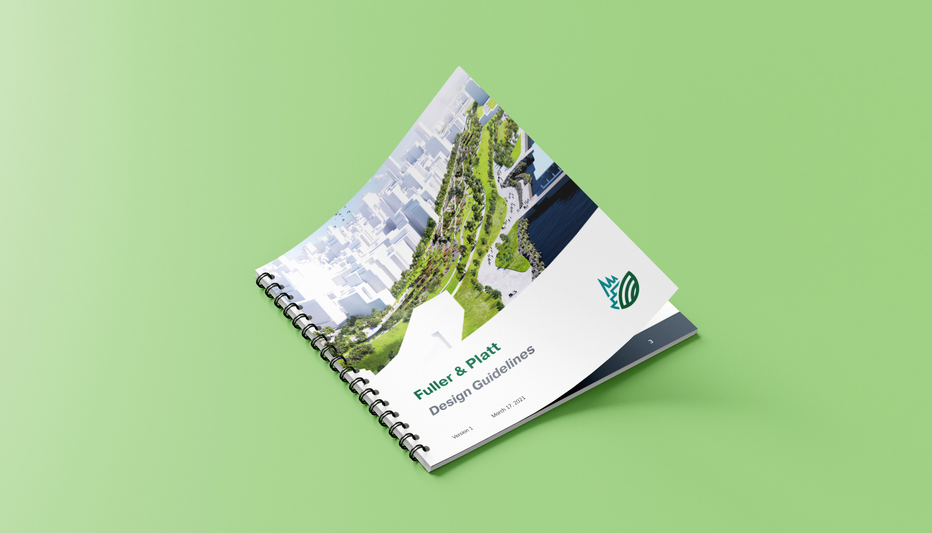
Brand Guidelines
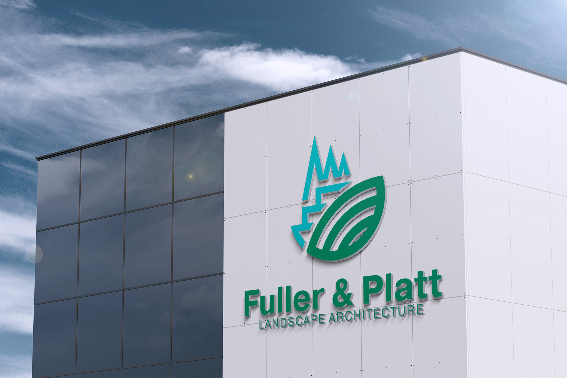
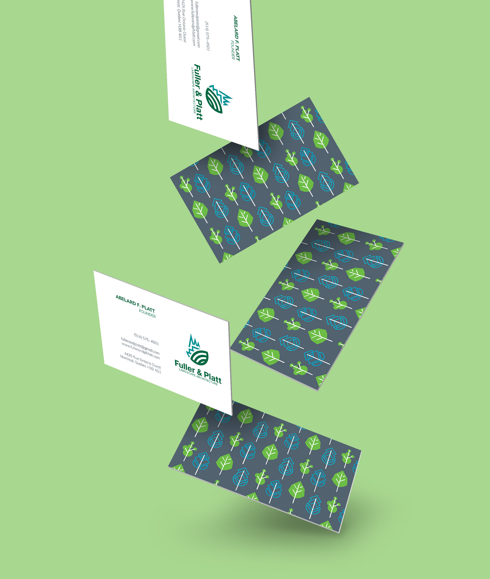
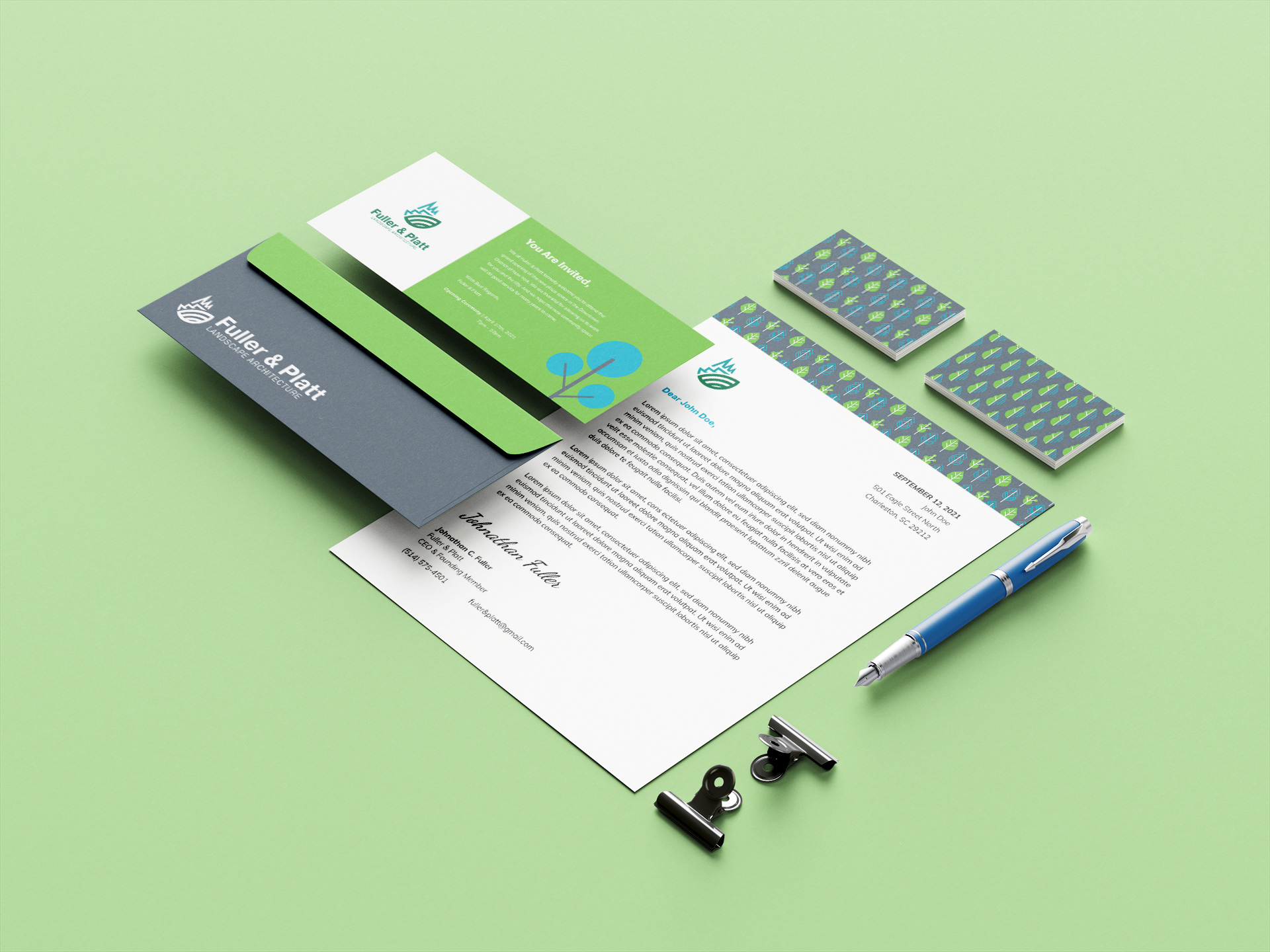
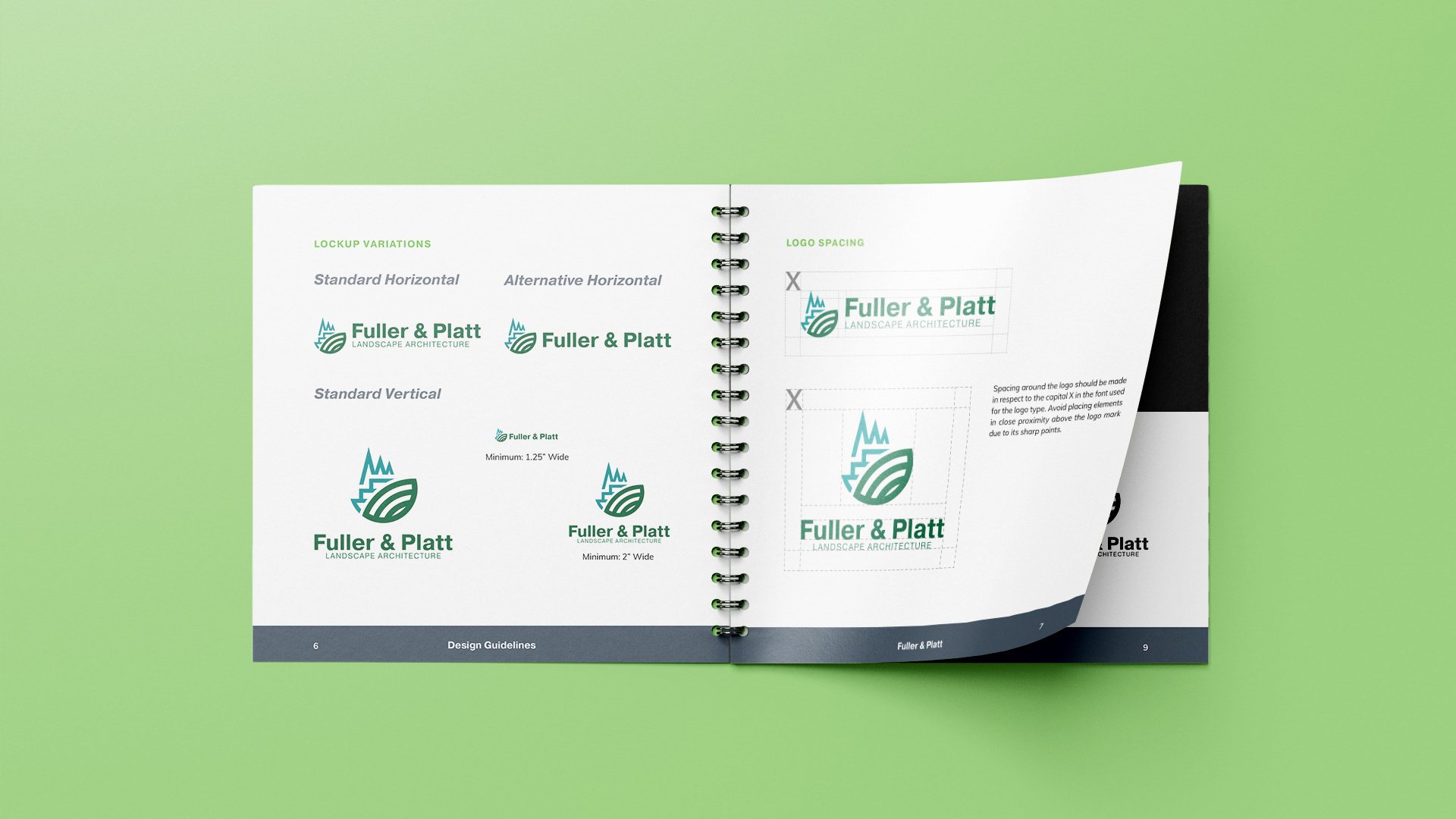
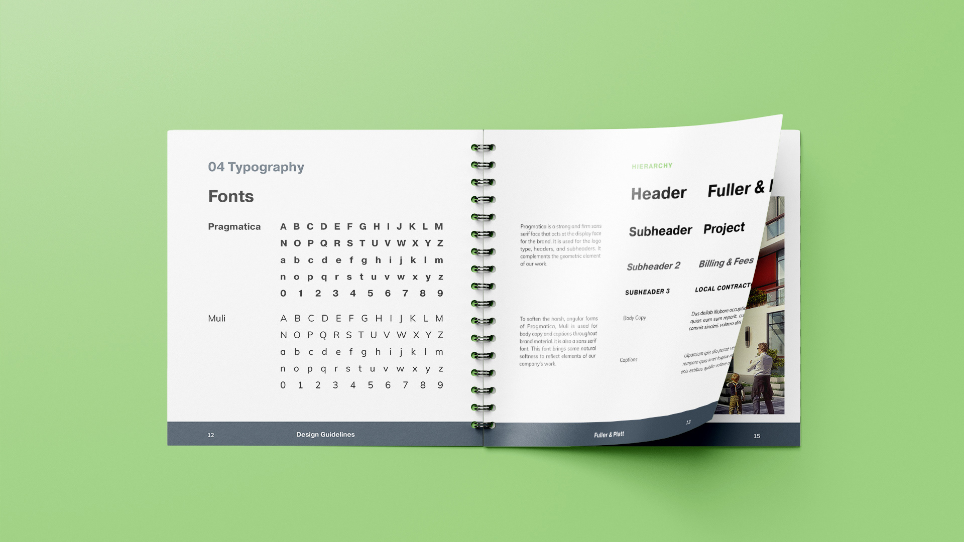
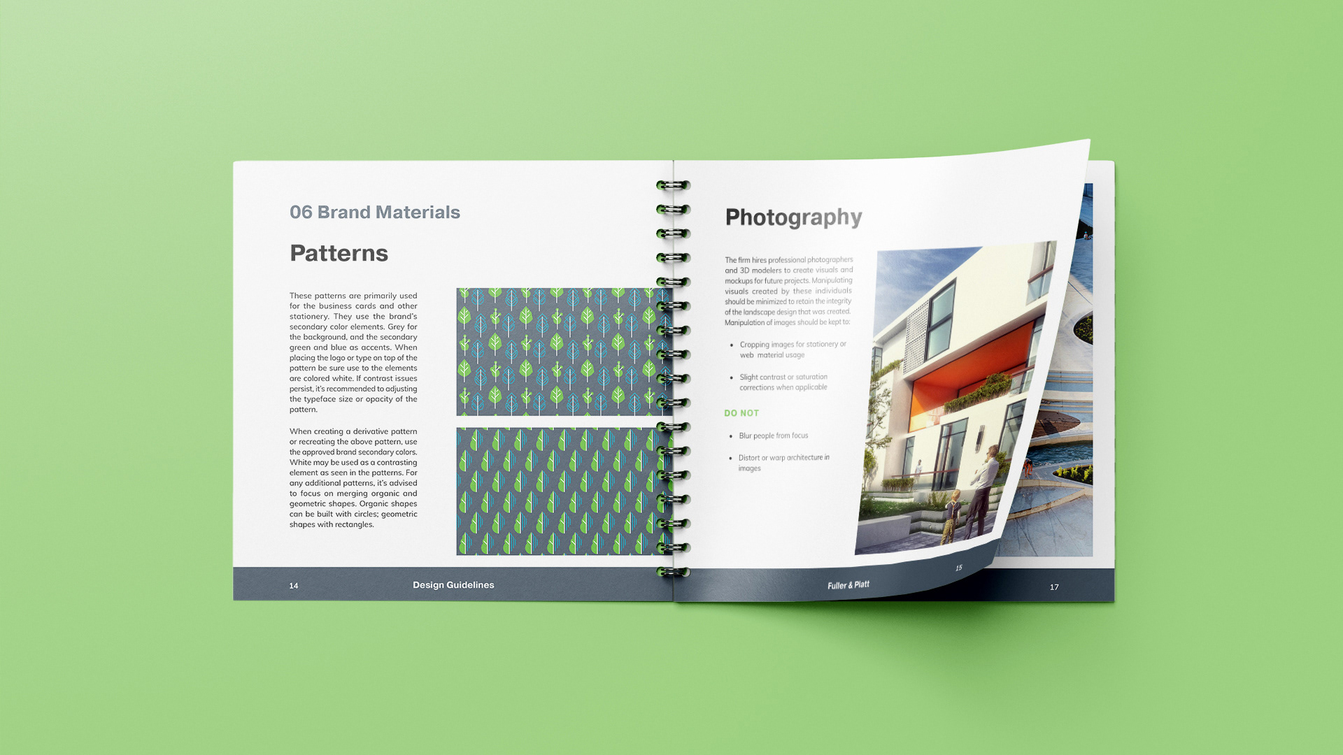
Fuller & Platt's new identity begins with a representational symbol that signify the brand work to sculpt landscapes for human needs. Colors for the brand work reflect not only the materials of modern construction, but those of nature.

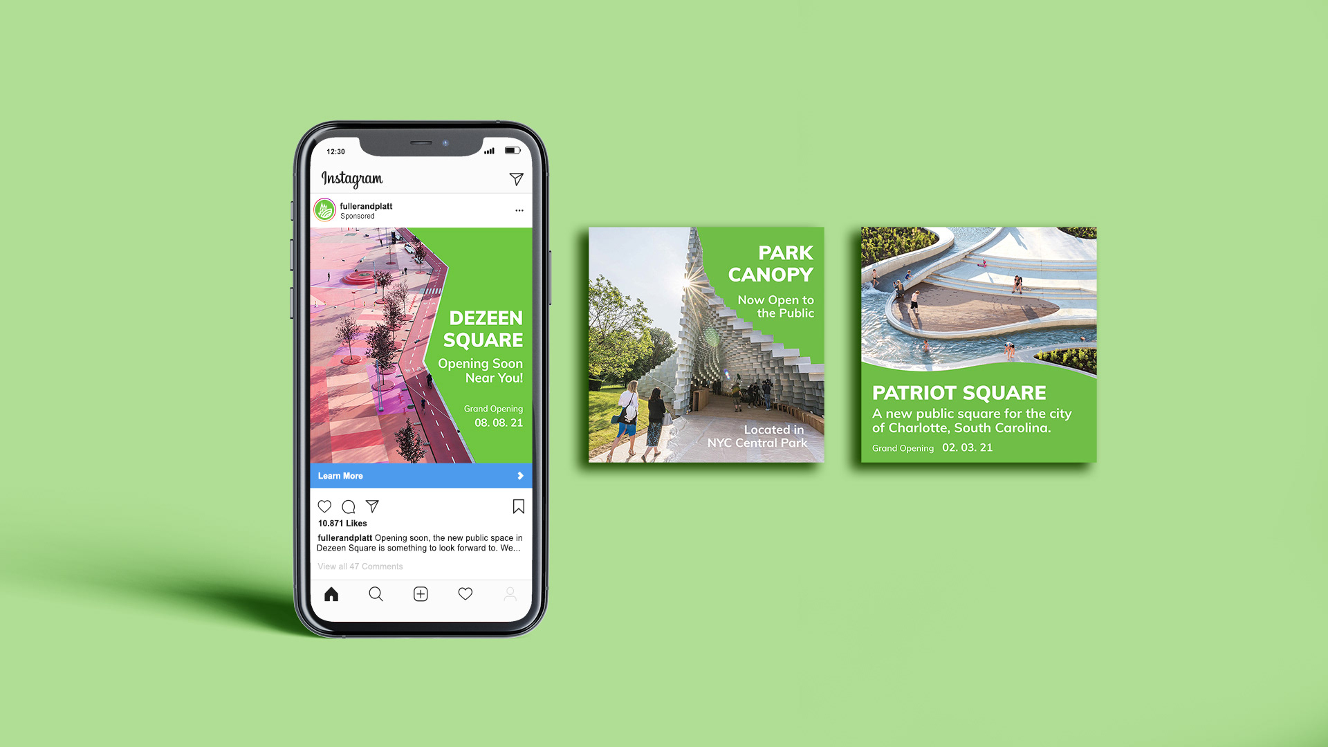
Digital Presence
To improve the impact of grand openings of new constructions, the company has expanded its digital outreach. Advertisements and social media posting target locals in cities about the new constructions and the progress of construction until the grand reveal. The company maintains as well a website to showcase their portfolio of works and future projects.

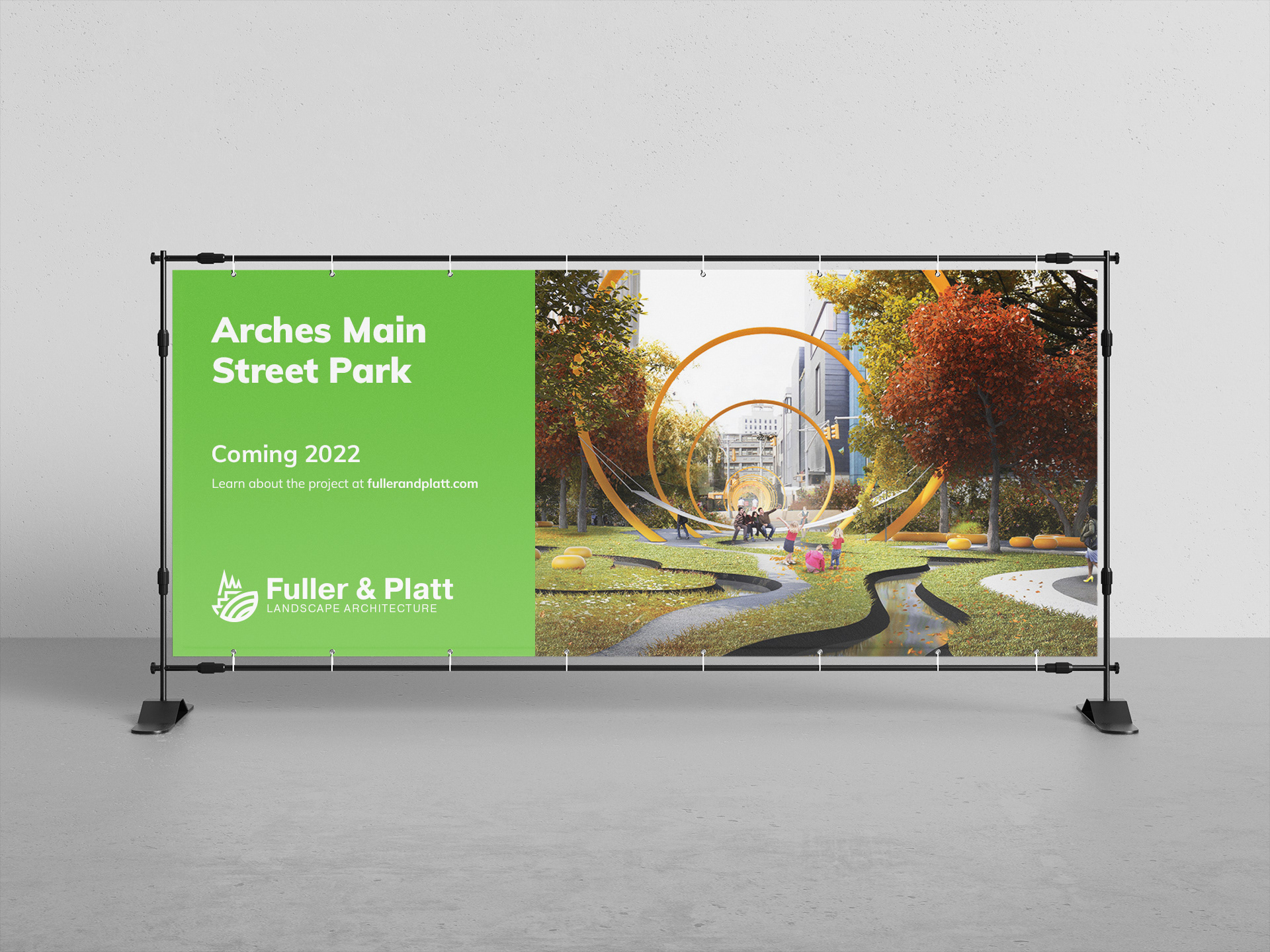
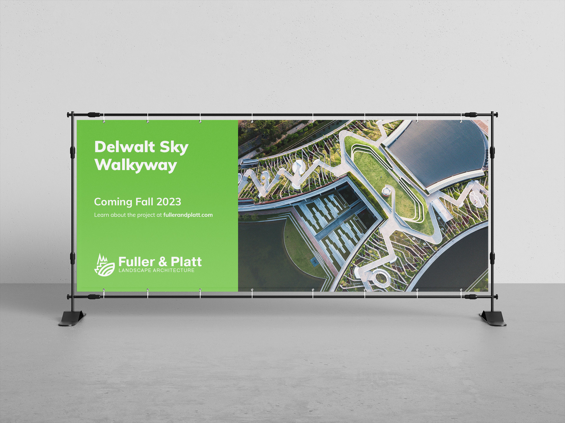
Construction Banner
As the first form of branding the wider public will see, the layout is kept simple: the project site name, delivery date, website, logo, and landscape mock up. All the necessary information someone will need if they communing nearby the space.