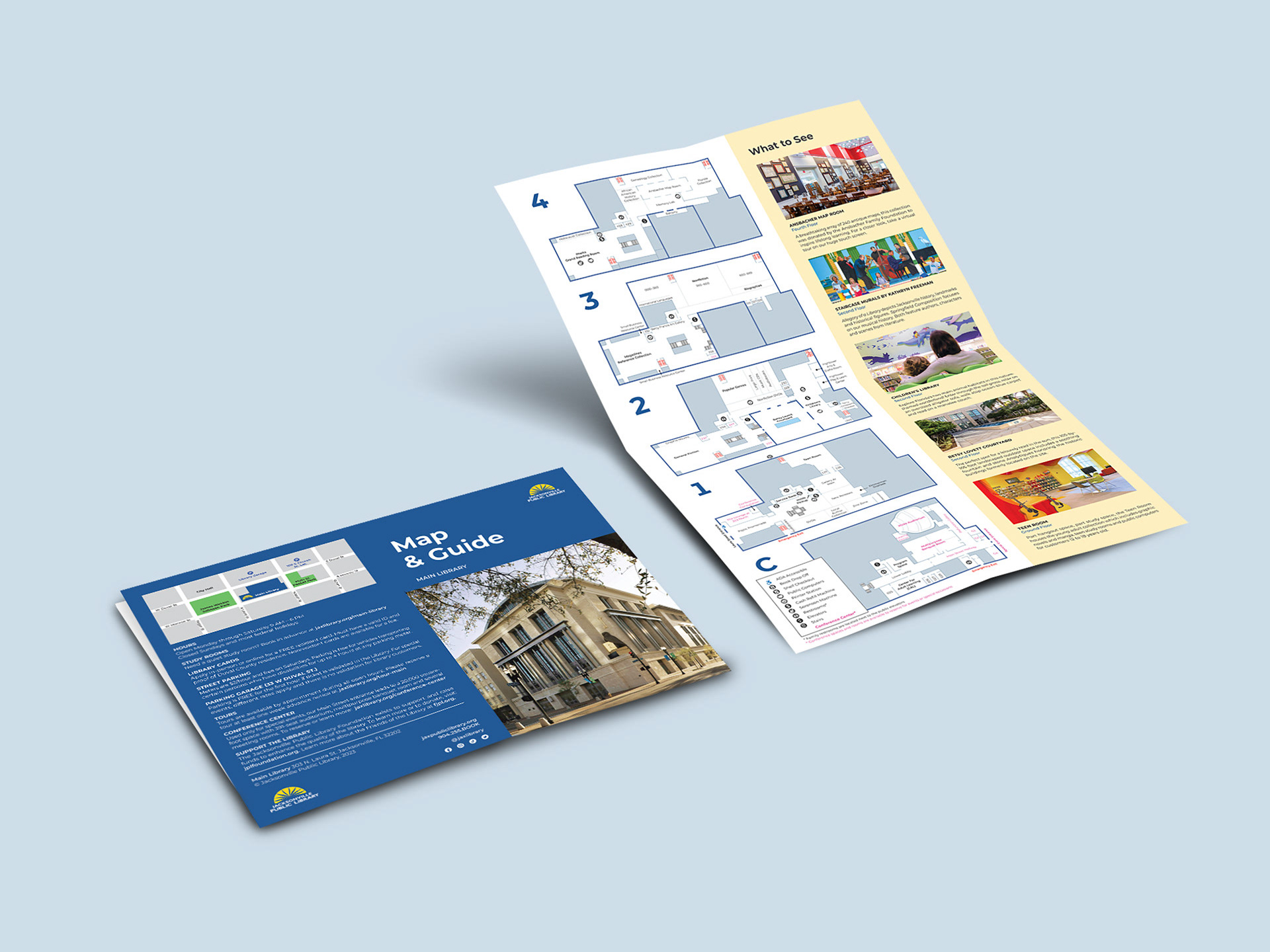
Pediatric Wayfinding
Environmental Design
A wayfinding system for a pediatric hospital that improves the patient experience and provides functional navigation.
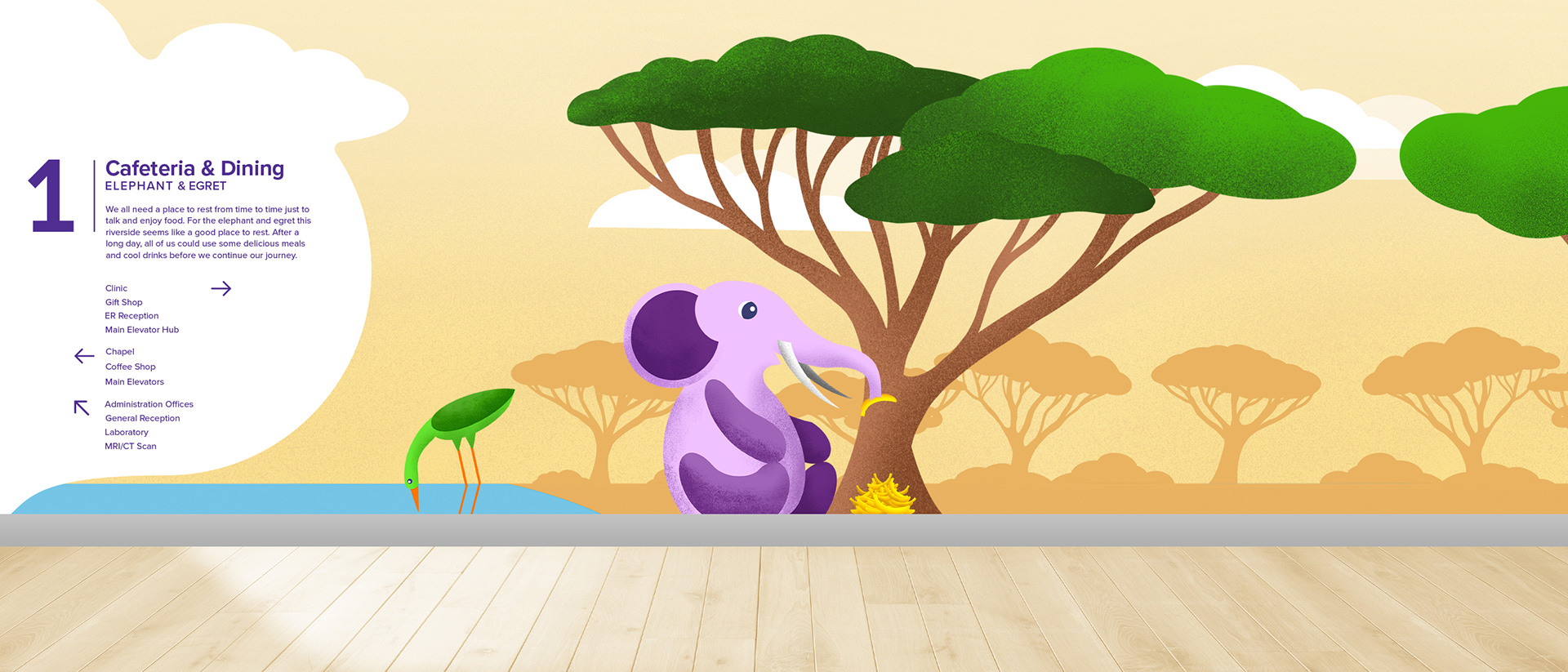
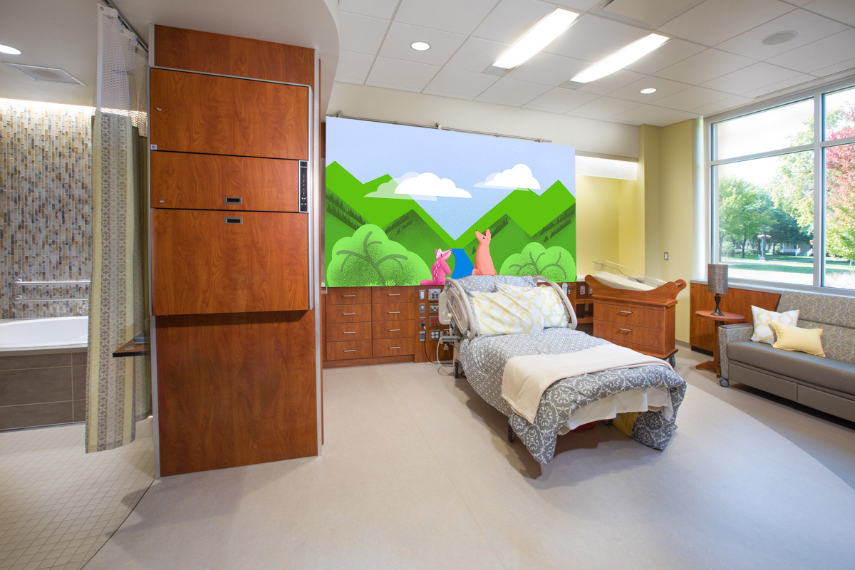
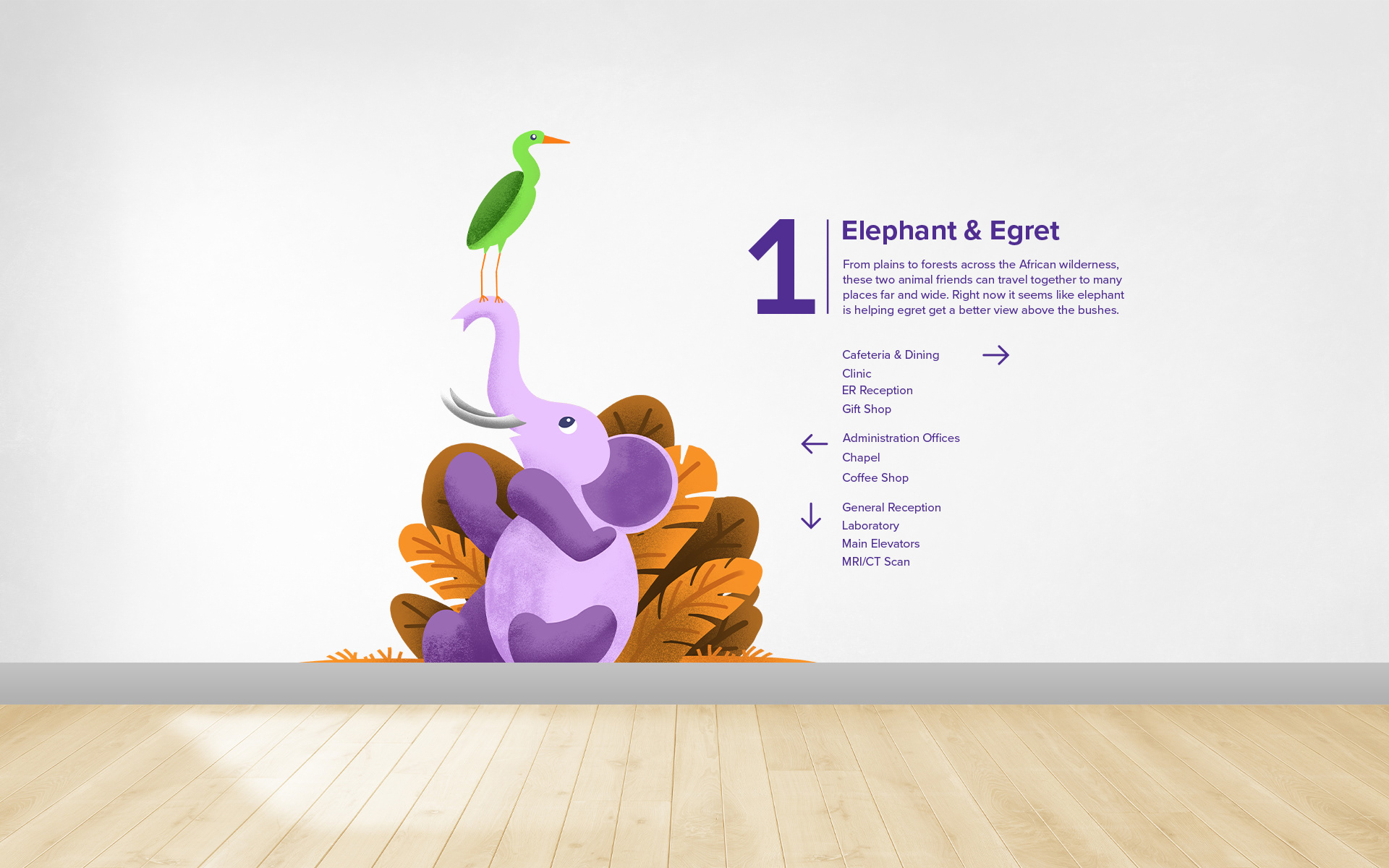
Hospitals are ominous places that are a labyrinth of hallways and corridors. Rigid, code adhering architecture that is as sterile and cold to those who walk it. As a solution to this issue, these environmental graphics implement the use of illustrations to ground the walls with warmth, color, and stories. Based on a theme of animal friendships, this project was a response to the cold hospital environment.
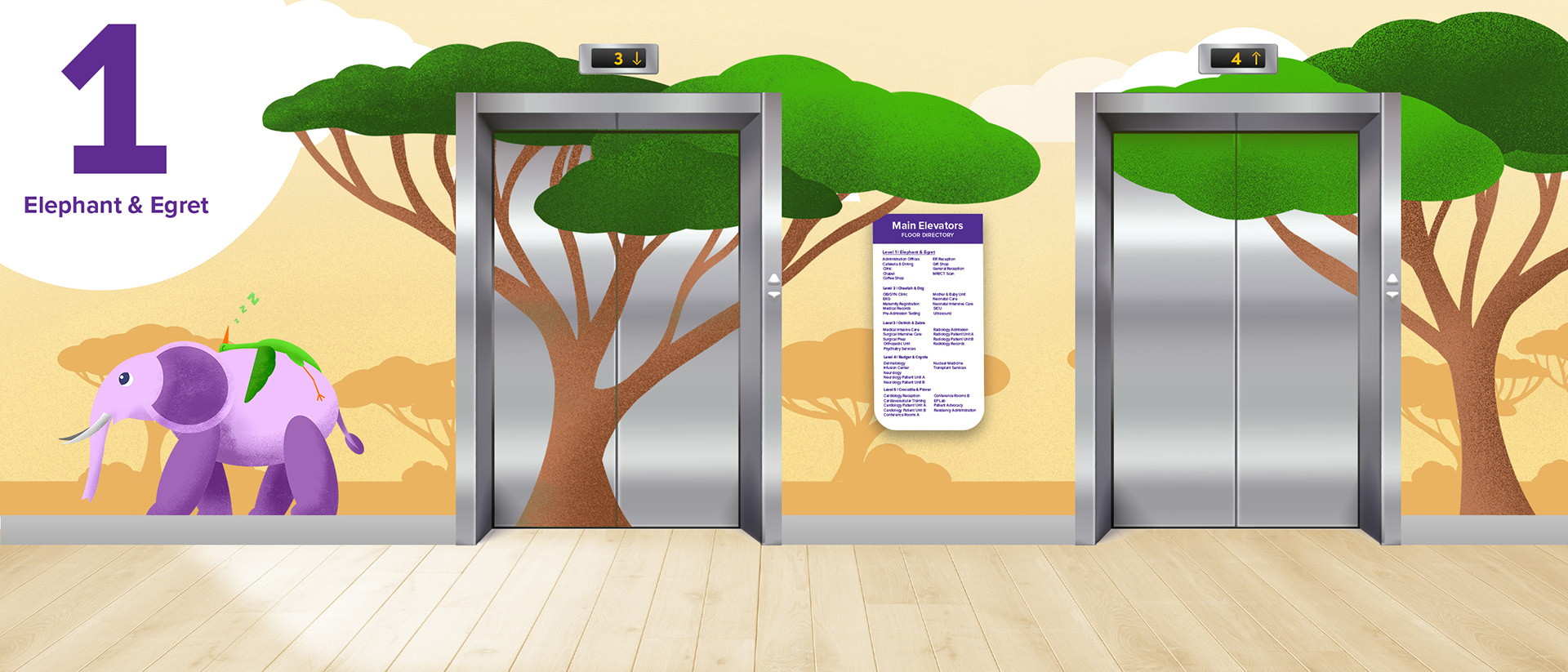

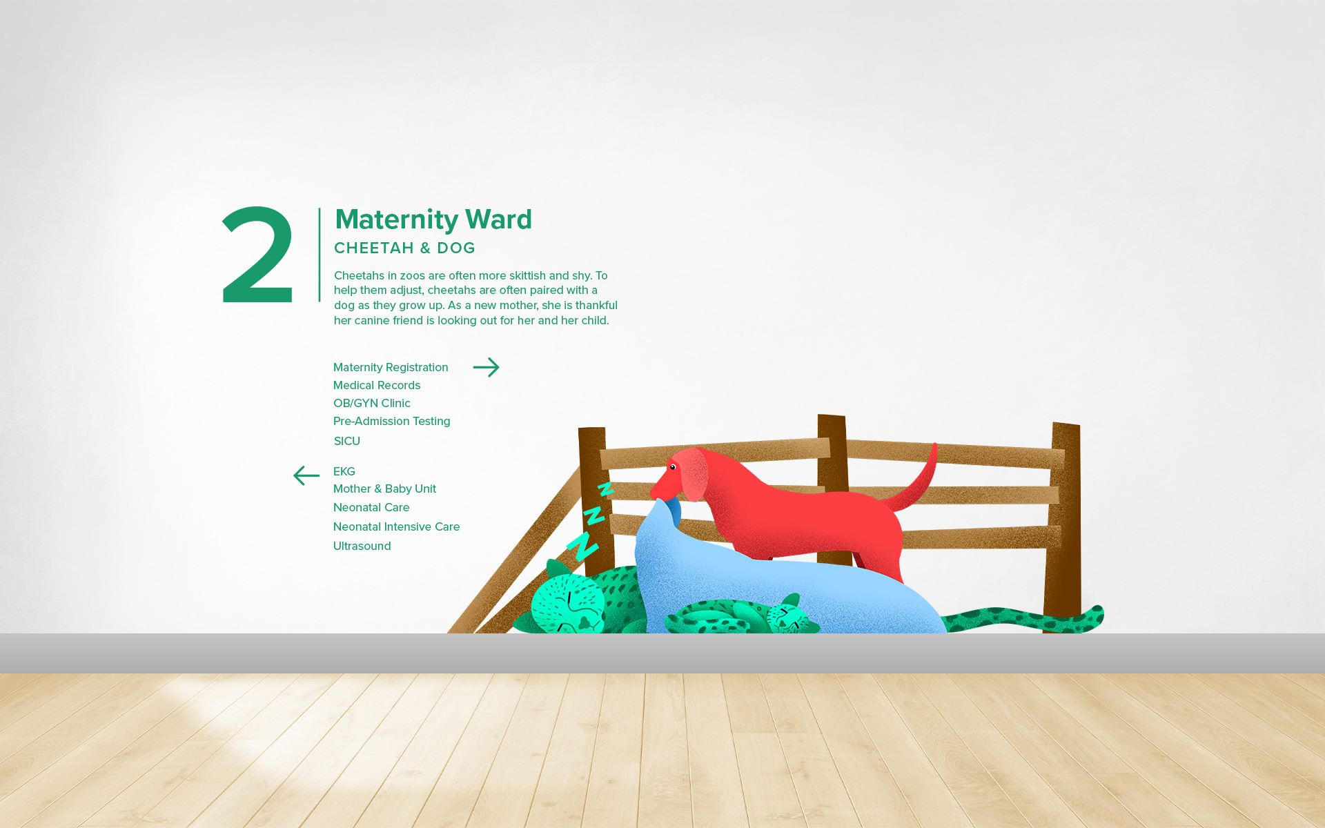
Designed for a five story hospital, each floor has one pair of animal friends. Colors between each floor are meant to be distinct, identifiable, and be memorable for navigational needs. The separation of colors on each floor helps inform the viewer of which floor they are presently with a quick glance. Color is the first step to let users engage with confidence this signage system.
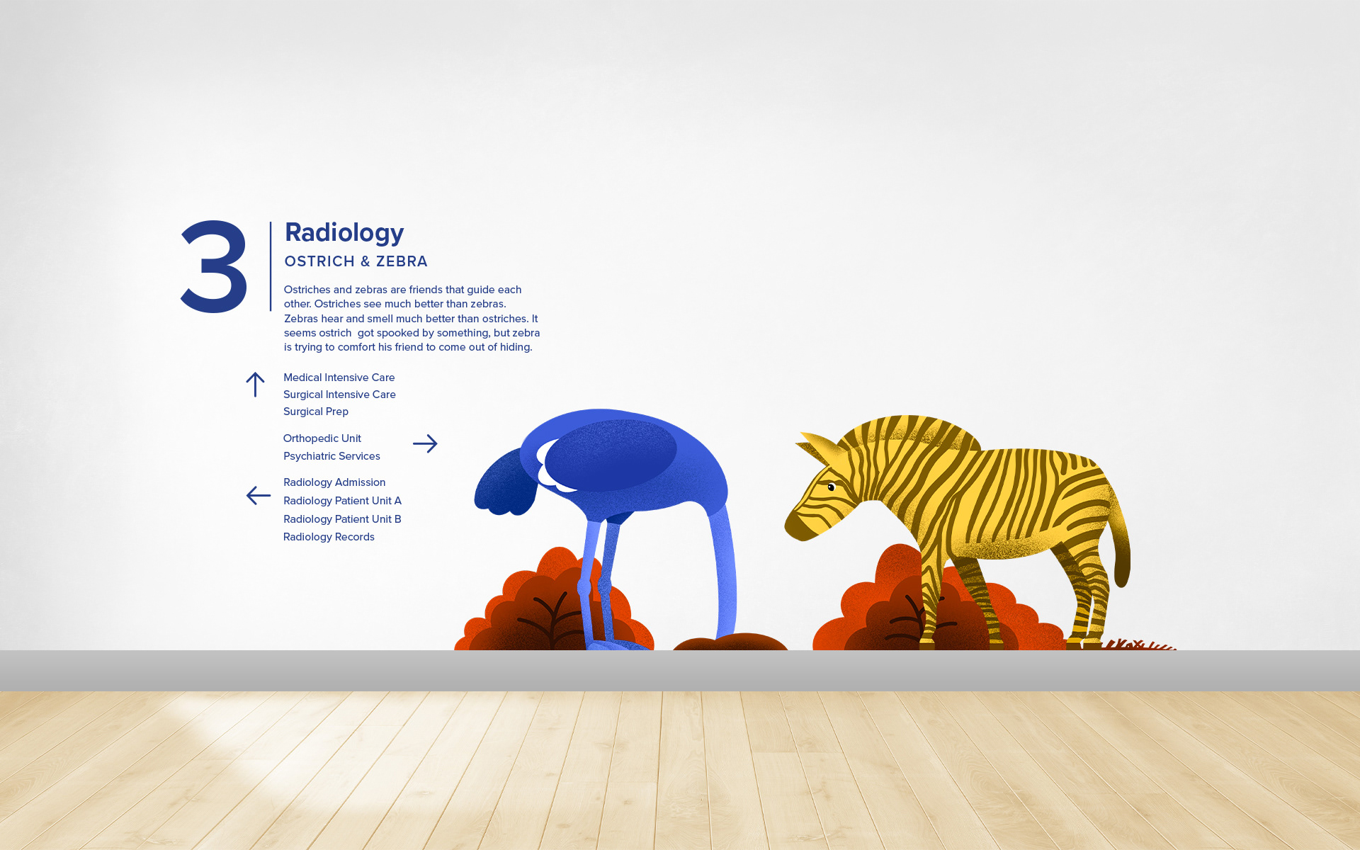
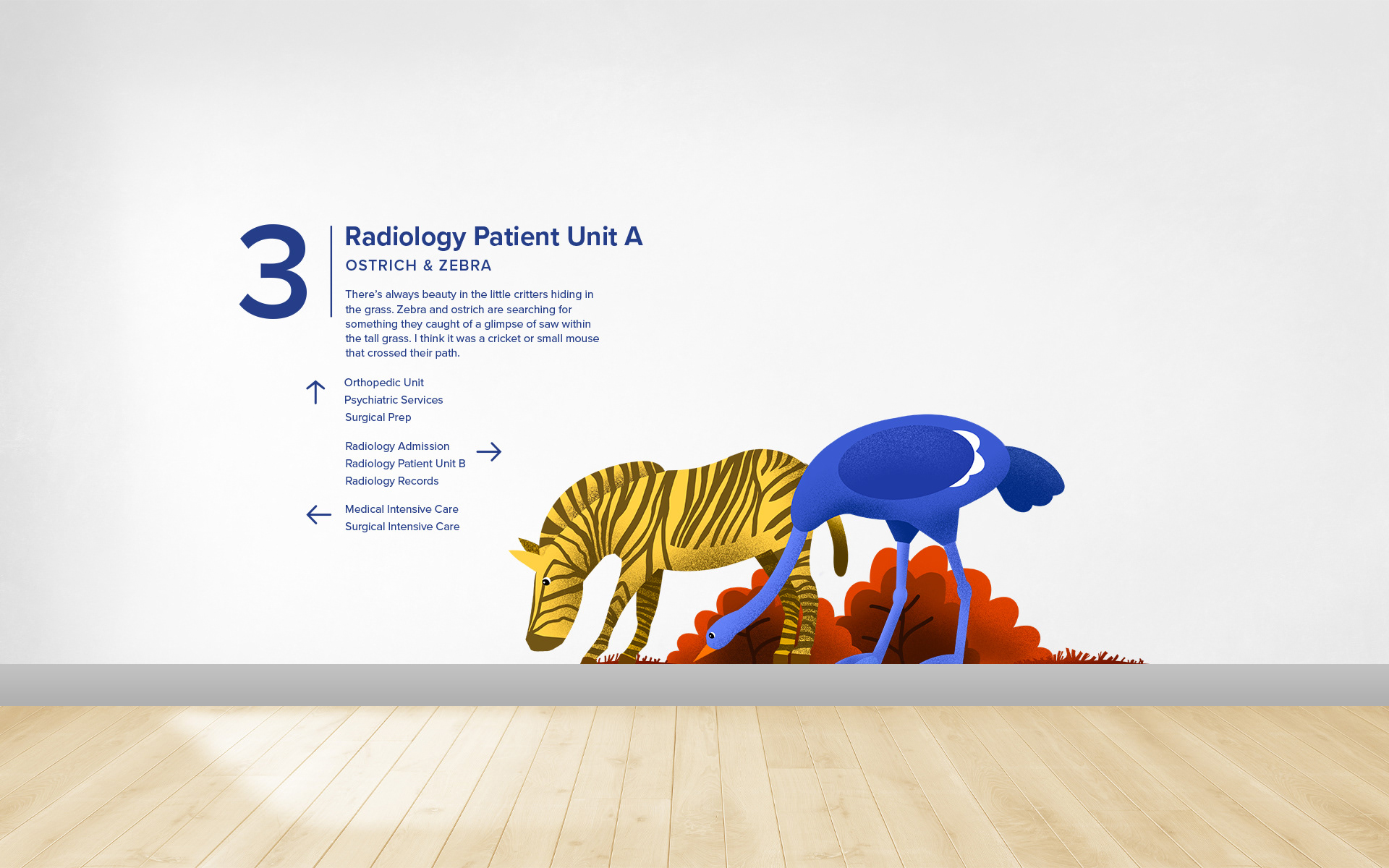
Two types of signs exists within this system: small signs and large murals. Small signs are located at strategic junctions or along long hallways. They offer small snippets of a contextual story to the current interaction of the animal friends. To maintain cohesion, each sign makes use of a grid system. Murals are reserved for larger spaces such as elevators hubs, long hallways, or patient rooms. They fill in otherwise blank spaces with beautiful imagery. Mural backgrounds are based on the natural ecology of each pair of animals.

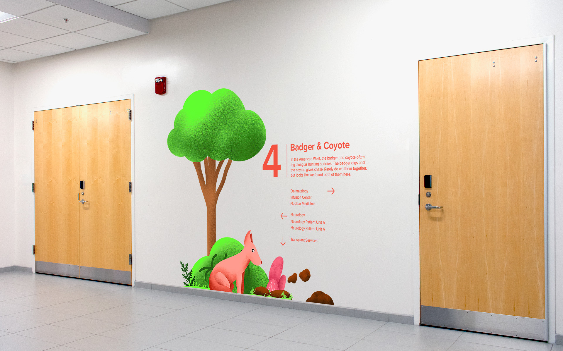
The illustration style of this system has to appeal to the users of the hospital: patients, visitors, and staff. This style is a compromise between being too far detailed or abstract in depiction that it wouldn't alienate any group within the audience. A style that is basic enough for a young child to comprehend, but mature enough that an adult may still find appeal in it. The result of this style became a vector-like style with an emphasis on forms shapes. Textures are used to add visual interest and slight dimension.
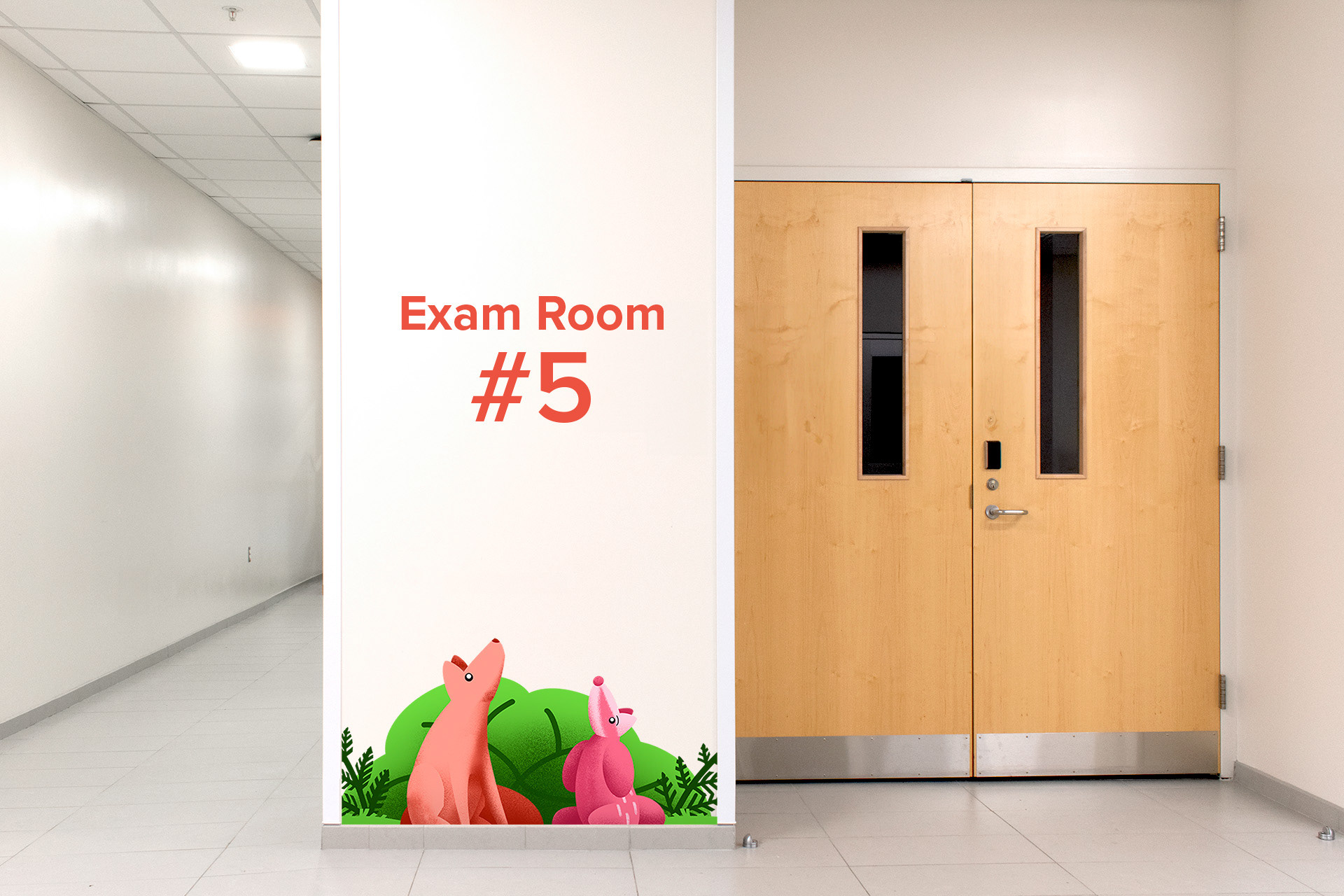
This environmental graphics system also extends into patient rooms. The space above the headboards of patient beds are murals relative to the theme of the floor they currently present on. Murals change appearance between daytime and nighttime. As the sun set, murals transition to an illumination of the stars and the moon.