Pediatric Wayfinding
Environmental Design
A wayfinding system for a pediatric hospital that improves the patient experience and provides functional navigation.
Improving the Pediatric Hospital Navigation Experience
Hospitals are often a blank and sterile environment that exudes stress and uncertainty. In fact, I know of this first hand I because I used to wait within one just for the start of school across the street from it. Even as a young visitor, I was noticeably uncomfortable each time I waited there. A place of healing felt more like a complex prison labyrinth. Very opposite of the warm invitation that is often presented from such places. Inspired by these experiences, this project became an opportunity to create a solution to the dreary environmental and navigational issue that plagues hospitals.
The Hospital Experience & Pediatrics
Several factors contribute to the current state to of American hospitals: most were built in the last 50 to 100 years, regulated compliance to meet safety standards, and a utilitarian need to provide medical care over other needs patient of the patient's well being. The result of these factors creates a sterile, mechanical environment that discourages comforting the user.
With many hospitals within the country afflicted by poor design, the pediatric hospital became the ideal hospital of choice for this solution. Aside from caring for the most vulnerable and disadvantaged of us, pediatric hospitals are responsible for over 95% of tertiary care and 75% of terminal disease research. They are places in which significant breakthroughs are made and are pivotal to the furthering of standard medical care practices.
Although patients are the center of healthcare, the importance of design on the well being of patients, visitors, and staff contributes to a better hospital. Visitors and patients alike are more likely to return to engage with a hospital’s services if its well designed experience. And staff are more less likely to feel burn out from environmental stress.
Considerations, Insights, & Themes
The illustration style of this system has to appeal to the users of the hospital: patients, visitors, and staff. This style is a compromise between being too far detailed or abstract in depiction that it wouldn't alienate any group within the audience. A style that is basic enough for a young child to comprehend, but mature enough that an adult may still find appeal in it. The result of this style became a vector-like style with an emphasis on forms shapes. Textures are used to add visual interest and slight dimension.
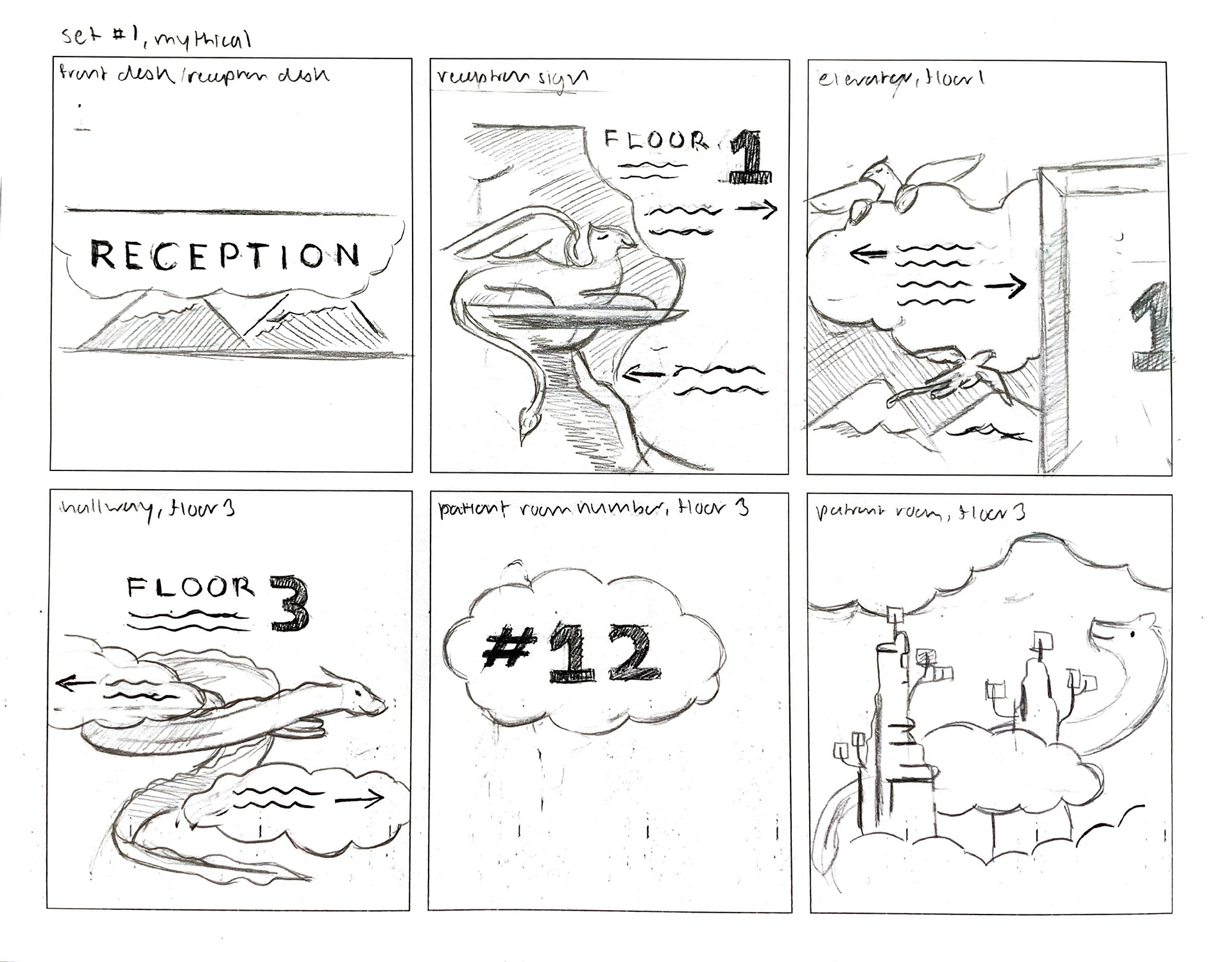
Initial explorations for a theme included fantasy, such as mythical beasts or dream-like depictions. This meant that the theme would be inclusive, but as a result would be based on things not found in this world may not hold any significance to the non-imaginative and risk alienating others due to unfamiliarity.
A theme far more grounded in reality was chosen instead for familiarity. This idea eventually formed into a theme exploring friendships using real life animal relationships found in nature.
Composing a Sign
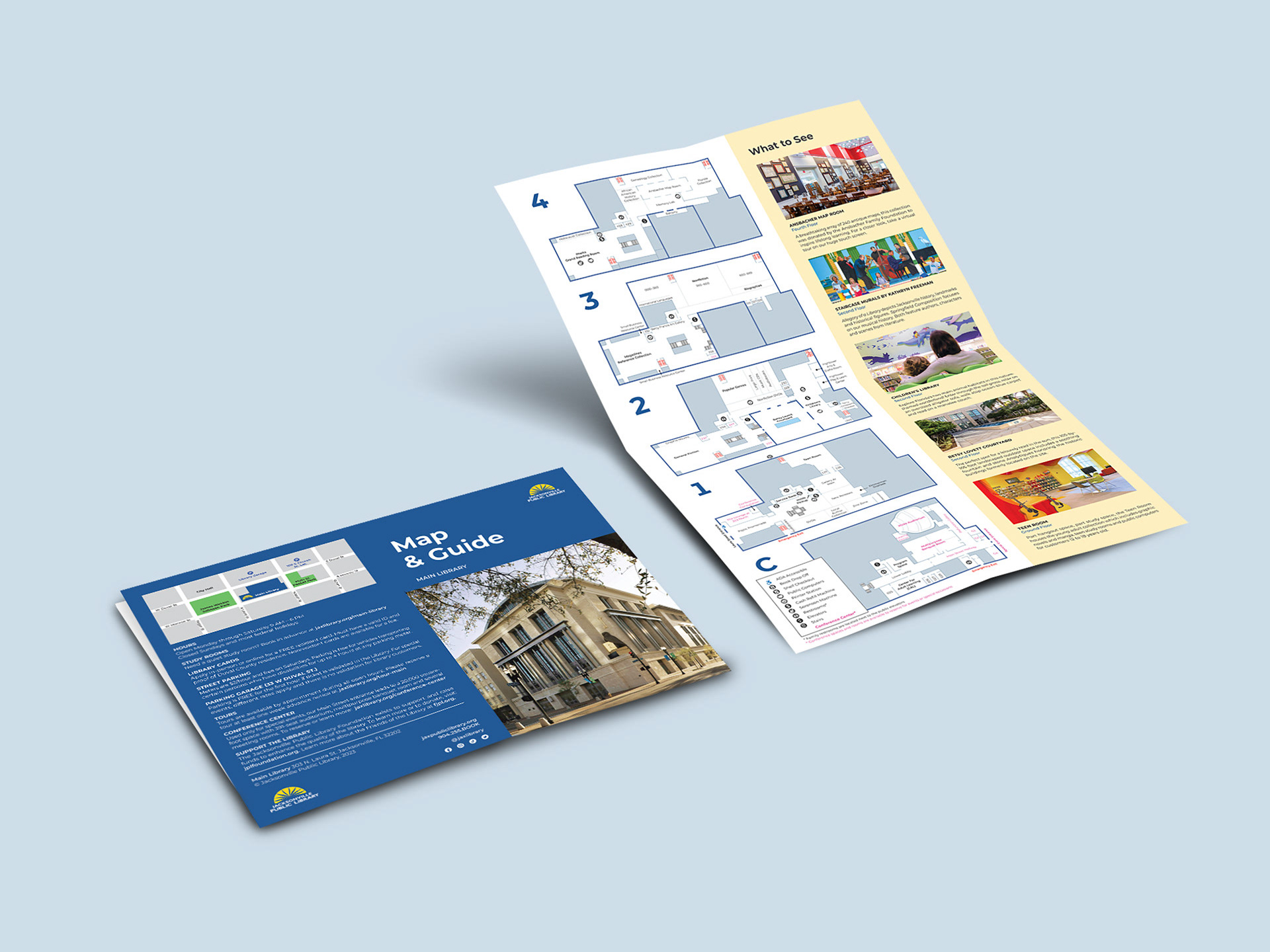
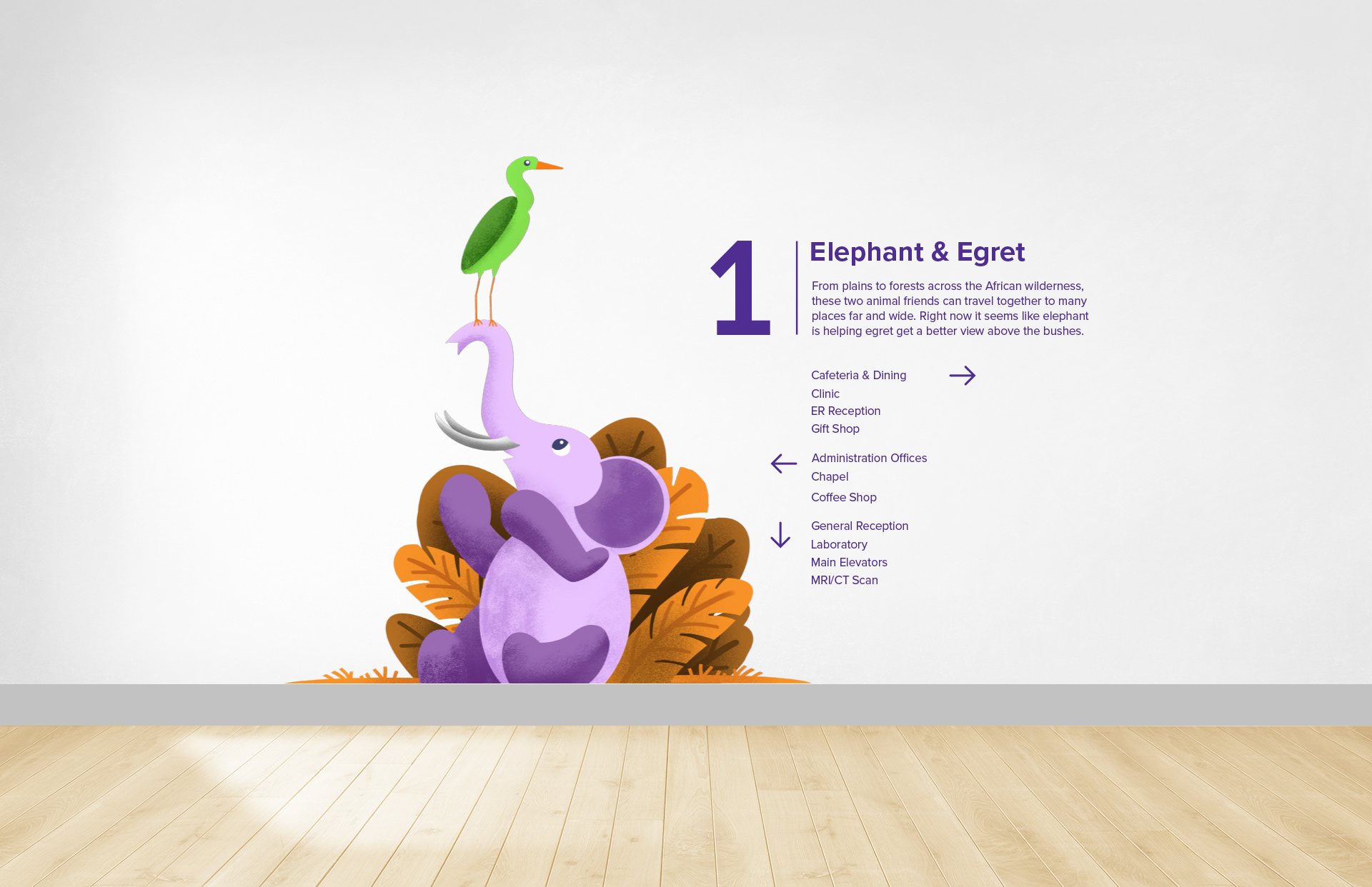
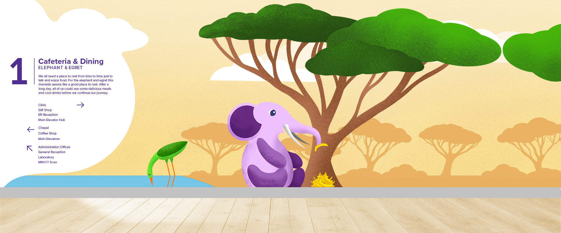
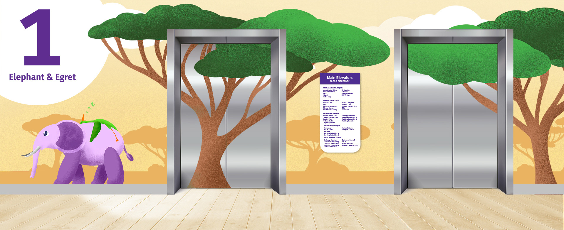
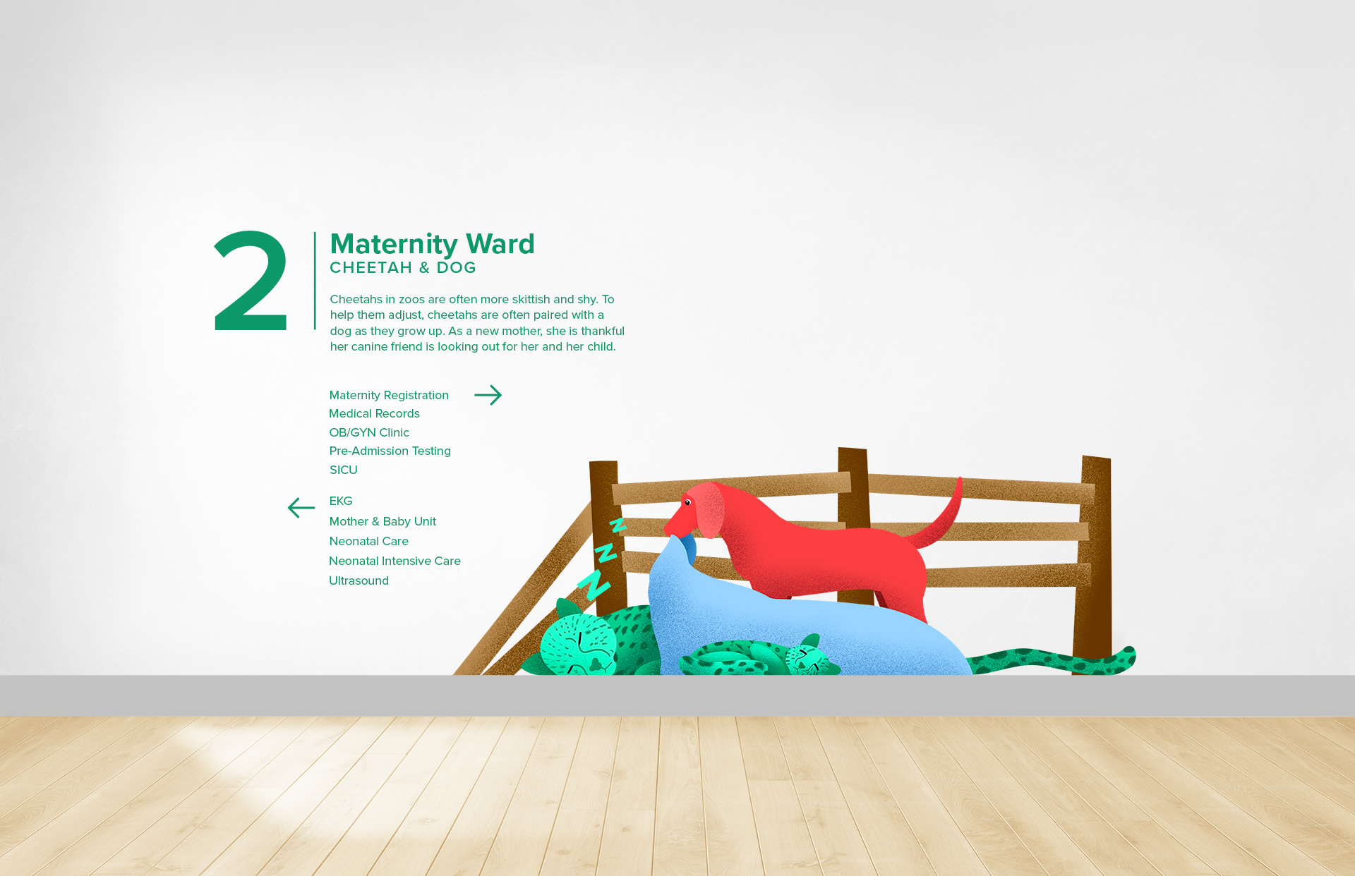
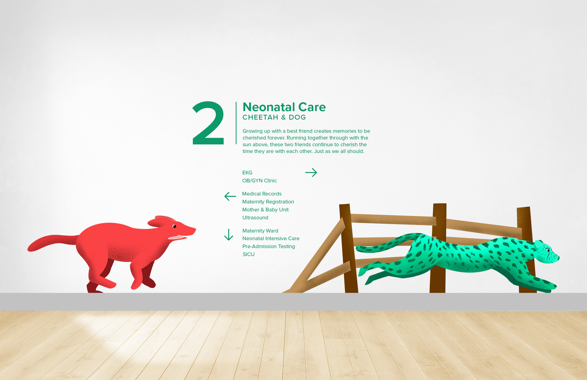
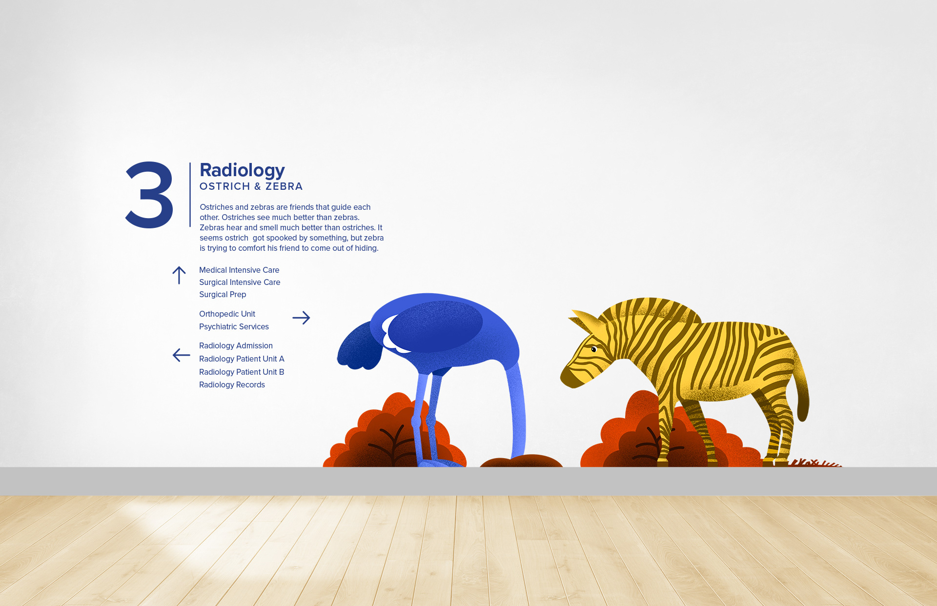
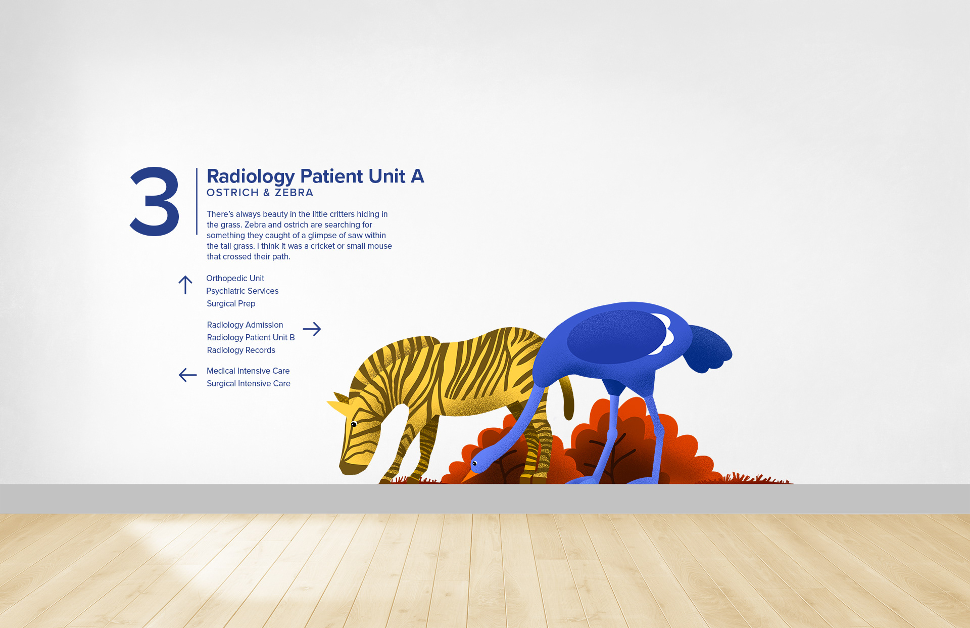
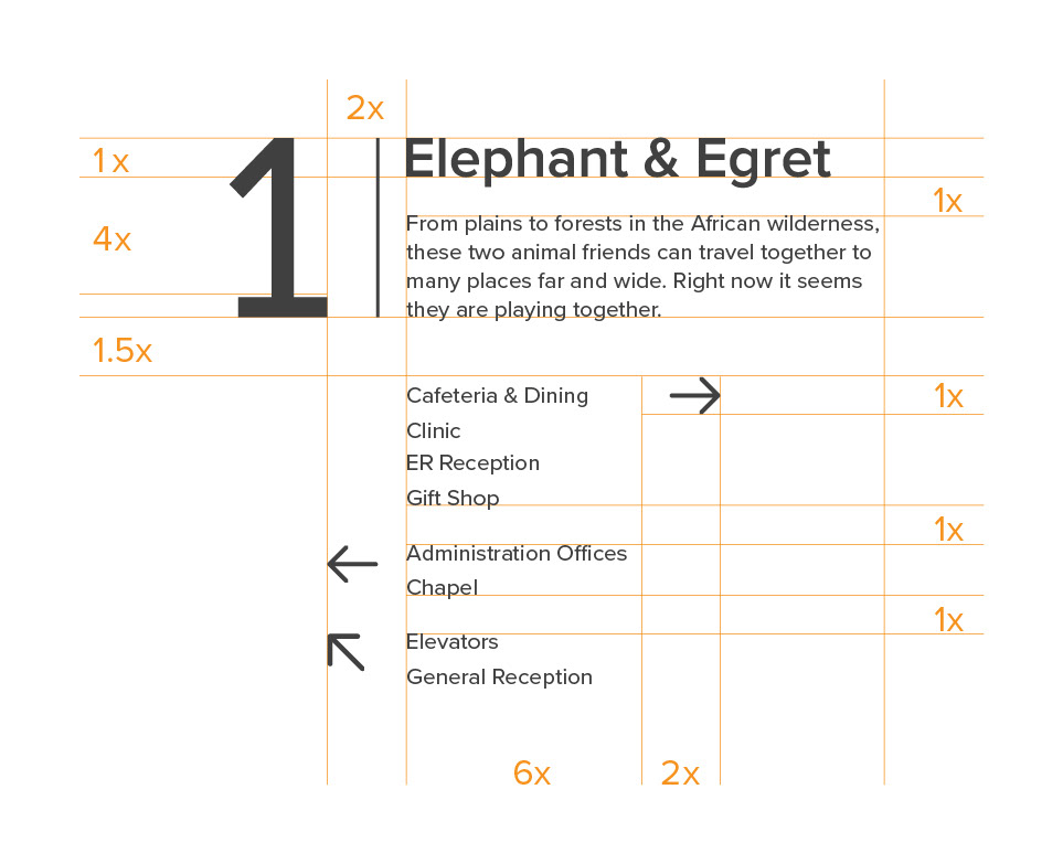
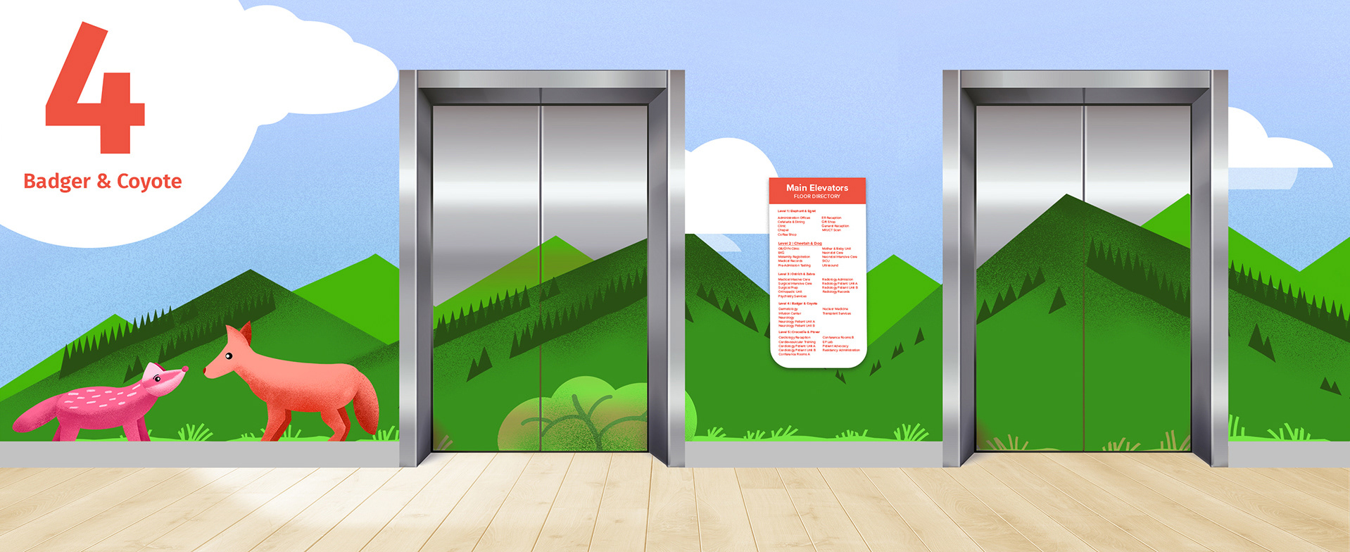
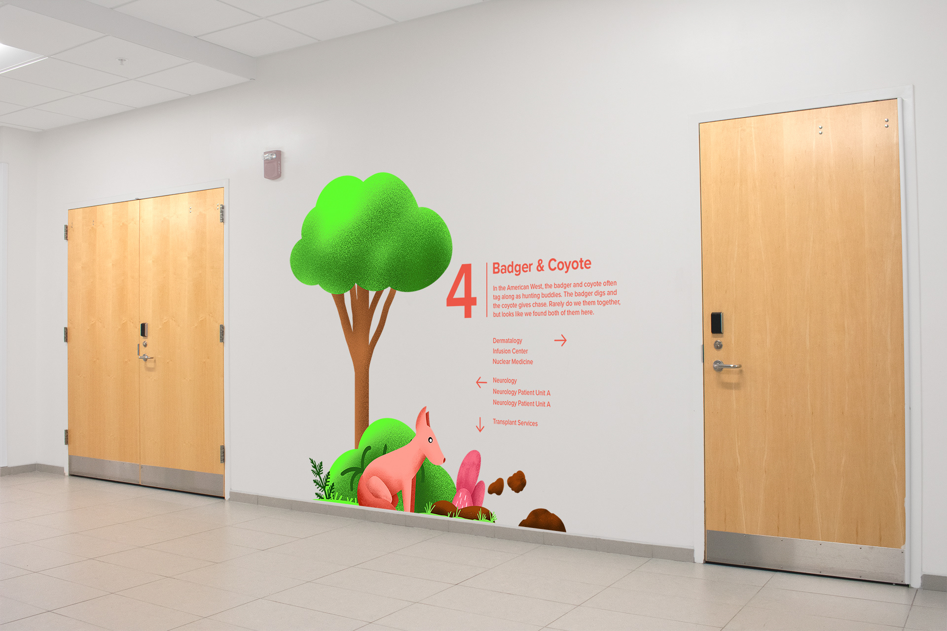
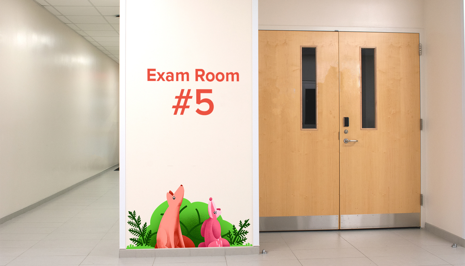
Designing around a five-floor pediatric hospital, each floor has one unique pair of animal friends: elephant and egret, cheetah and dog, ostrich and zebra, badger and coyote, crocodile and plover.
Each pair is uniquely colored to add life and vibrancy against the white walls of each corridor. A common color scheme for each pair also differentiates floors from one another. To add more life to these relationships each pair is always depicted interacting together doing something different.
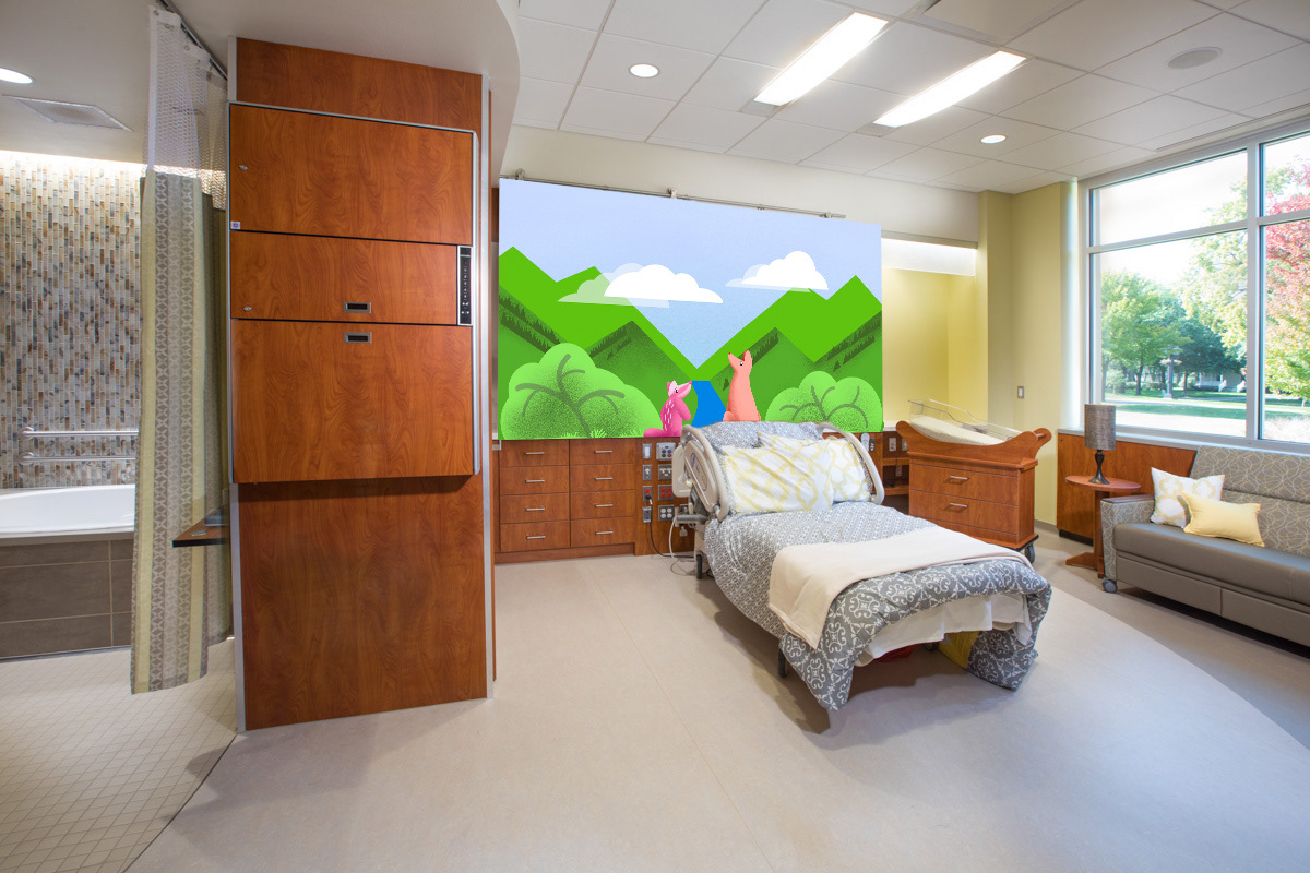
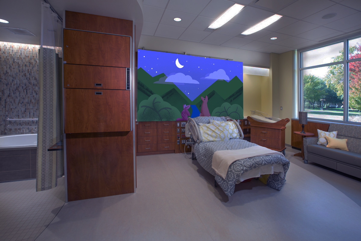
Two types of signs exists within this system: small signs and large murals. Small signs are located at strategic junctions or along long hallways. They offer small snippets of a contextual story to the current interaction of the animal friends. To maintain cohesion, each sign makes use of a grid system. Murals are reserved for larger spaces such as elevators hubs, long hallways, or patient rooms. They fill in otherwise blank spaces with beautiful imagery. Mural backgrounds are based on the natural ecology of each pair of animals.
The Experience of the Journey
From the first floor to the fourth floor, each sign presented along the way are possible points along the journey of a first-time visitor or patient on their way to their room. Along the way they’ll encounter the adventures of the elephant and egret, the compassion of the dog for his cheetah friend, or the wandering travel buddies of the badger and coyote. By the time this user has walked through the halls they should be at ease and comfortable navigating with the signs.
When they are finally brought to their room they are greeted by a vibrant mural to remind them of the journey. And when the lights dim in the room the mural lights up with the animal friends to keep them company.